
Firstly this is the question I ask myself when presented with this brief, how can I create a great campsite logo? The project is to design a logo for Keel Camping. A camping company based on Achill Island in Ireland. This would require incorporating elements that represent the location and the company's services. Since this is a family campground, designing a family camping logo is required. Furthermore, Achill Island is full of beautiful beaches, stunning landscapes, and rich history. The campground logo design should reflect these characteristics.
Of course, one creative idea is to use the outline of Achill Island in the logo design. This instantly gives the logo a sense of place and identity. Complementing this with an image of a tent or a camper van. This can effectively represent the camping aspect of the business. Using earthy colours such as green, brown, and blue is recommended. This is to reflect the natural beauty of Achill Island and the outdoor experience it offers. Green symbolises the lush landscapes, brown represents the rugged terrain, and blue signifies the pristine waters surrounding the island.
Another approach is to incorporate the Irish language into the logo. Given the importance of the Irish language to the island’s culture, including an Irish phrase or word related to camping can add a unique touch. An example is "Talamh Fáilte," which translates to "Welcome to the Land." This not only enriches the logo with cultural significance but also connects with both locals and tourists. The use of the Irish language can evoke a sense of authenticity and pride, making the logo more appealing and meaningful.

Typography is a critical aspect of logo design. Choosing a font that aligns with the company’s personality is essential. For a camping logo, a bold and rustic font can evoke the outdoor experience, while pairing it with a modern sans-serif font can create a balanced and contemporary design. This combination ensures that the logo is both eye-catching and readable across various mediums. A rustic font can convey a sense of adventure and ruggedness, ideal for a camping site, while a sans-serif font can add a touch of modernity and simplicity, making the overall design more versatile.

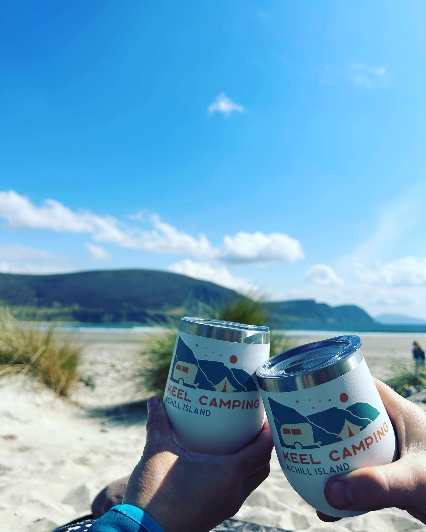
Image source: Keel Camping Instagram
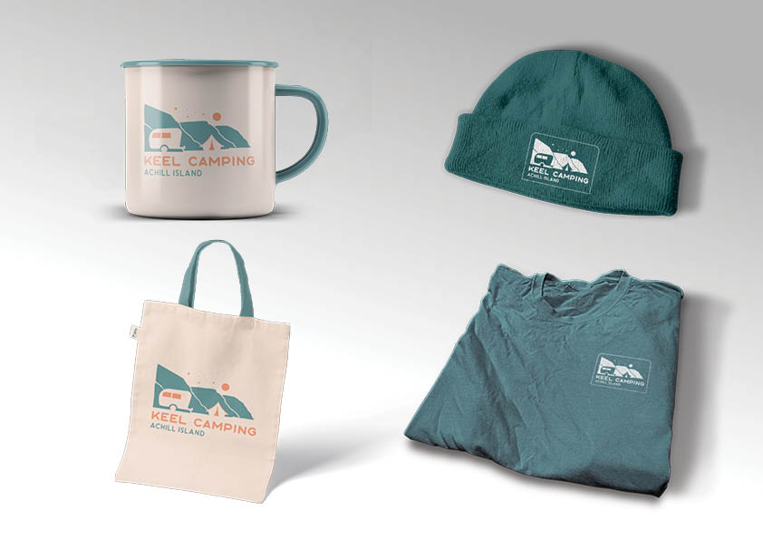
The logo for Keel Camping should be simple, memorable, and versatile. A simple design ensures that the logo remains recognizable even when resized for different applications, such as merchandise, signage, and online platforms. Simplicity is key in logo design because it enhances the logo’s versatility and adaptability. A memorable logo helps in building brand recognition and loyalty, making it easier for customers to recall and associate with the brand.
Versatility is another important consideration. The logo should be scalable to different sizes and adaptable to various color schemes. This means the logo should look good whether it’s on a large billboard or a small business card. It should also maintain its integrity when reproduced in black and white or in different colors, ensuring it’s functional across different mediums and backgrounds.
The logo should effectively convey Keel Camping’s brand and values. It should represent the essence of family-friendly camping on Achill Island, showcasing the natural beauty and adventurous spirit of the location. Therefore, this connection to place and experience helps build a strong brand identity. The logo should evoke feelings of warmth, welcome, and adventure, aligning with the family-oriented services and the unique experiences offered at Keel Camping.


To further enhance the logo, consider incorporating elements of local flora and fauna. This could include imagery of native plants, birds, or animals, which can add a touch of local flavor and uniqueness. Indeed, such elements can help in highlighting the rich biodiversity of Achill Island, making the logo more engaging and informative.
In addition, using iconography related to camping, such as campfires, stars, or hiking trails, can also be effective. These symbols can convey the outdoor and adventurous spirit of the campsite, making the logo more appealing to potential visitors who are looking for a nature-centric getaway.
In conclusion, a well-designed family camping logo can significantly impact the success of a business. For Keel Camping, investing time and effort into creating a visually appealing and meaningful logo is essential. The logo should not only be aesthetically pleasing but also convey the unique characteristics of Achill Island and the welcoming nature of the campsite. By incorporating elements such as the outline of Achill Island, the Irish language, thoughtful typography, and relevant iconography, the family camping logo can become a powerful tool in attracting and retaining customers. Finally, A great logo is simple, memorable, versatile, and reflective of the brand’s identity and values. Thus ensuring it leaves a lasting impression on everyone who sees it.
